Overview
Brand mission
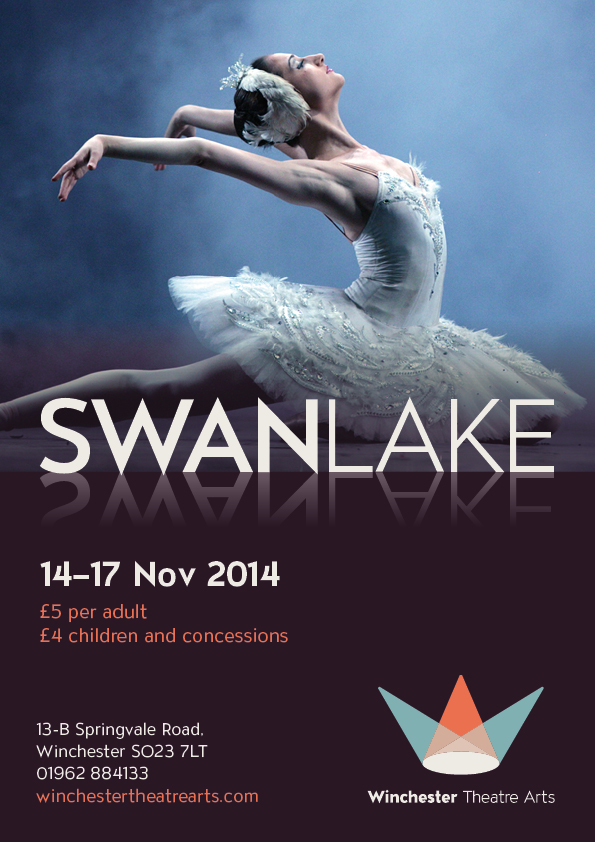
Winchester Theatre Arts is a performance driven theatre arts school. Friendly and welcoming, WTA opens the door to a successful career in the performing arts, putting its students on stage and in the spotlight.
The logo concept
The concept of the logo is based on the idea of spotlights forming an abstract W character. The marque also suggests a crown which nods towards Winchester's former status as the capital of England.
The brand concept
The performance led methodology of Winchester Theatre Arts aims to put students on stage and in the spotlight. The central concept of stage spotlights shining in darkness echoes this. This spotlight motif can be used to bring emphasis to elements and informs the light on dark colour scheme.
The tone of the brand
The overall tone of Winchester Theatre Arts is serious and contemporary, positioning WTA as the first step in a successful performing arts career. Also distancing the company from competitors whose primary function is entertainment or essentially childcare. These competitors don't offer the same rigour as WTA. For all of this Winchester Theatre Arts is a friendly and welcoming company which promotes a healthy attitude and passion for the performing arts.